

Chart of the Day (CotD) Ecuador Covid and Excess Deaths
Chart of the Day (CotD) Ecuador Covid and Excess Deaths
June 19, 2024

eldric.substack.com
This CotD was inspired by the following:
1) BBC News April 17, 2020 “Coronavirus: Ecuador sees massive surge in deaths in April” (see link: https://www.bbc.com/news/world-latin-america-52324218 ). As per the article: The government said 6,700 people died in Guayas province in the first two weeks of April, far more than the usual 1,000 deaths there in the same period. Guayas is home to Guayaquil - a key port and the part of the country worst-hit by Covid-19. They said authorities had been unable to keep up with the huge rise in deaths, leaving corpses wrapped in sheets in family homes and even in the streets. Authorities last week began distributing thousands of cardboard coffins in Guayaquil.
2) BBC News Agency December 23, 2021 “Covid: Ecuador makes vaccination mandatory for most citizens” (see link: https://www.bbc.com/news/world-latin-america-59772299 ). As per the article: Ecuador has announced that the Covid-19 vaccine will be mandatory for most citizens, saying the measure is needed because of a rise in infections and the spread of variants such as Omicron. The ministry said vaccines were a "shield of protection" against the virus, helping to prevent serious illness, hospitalisations and deaths.
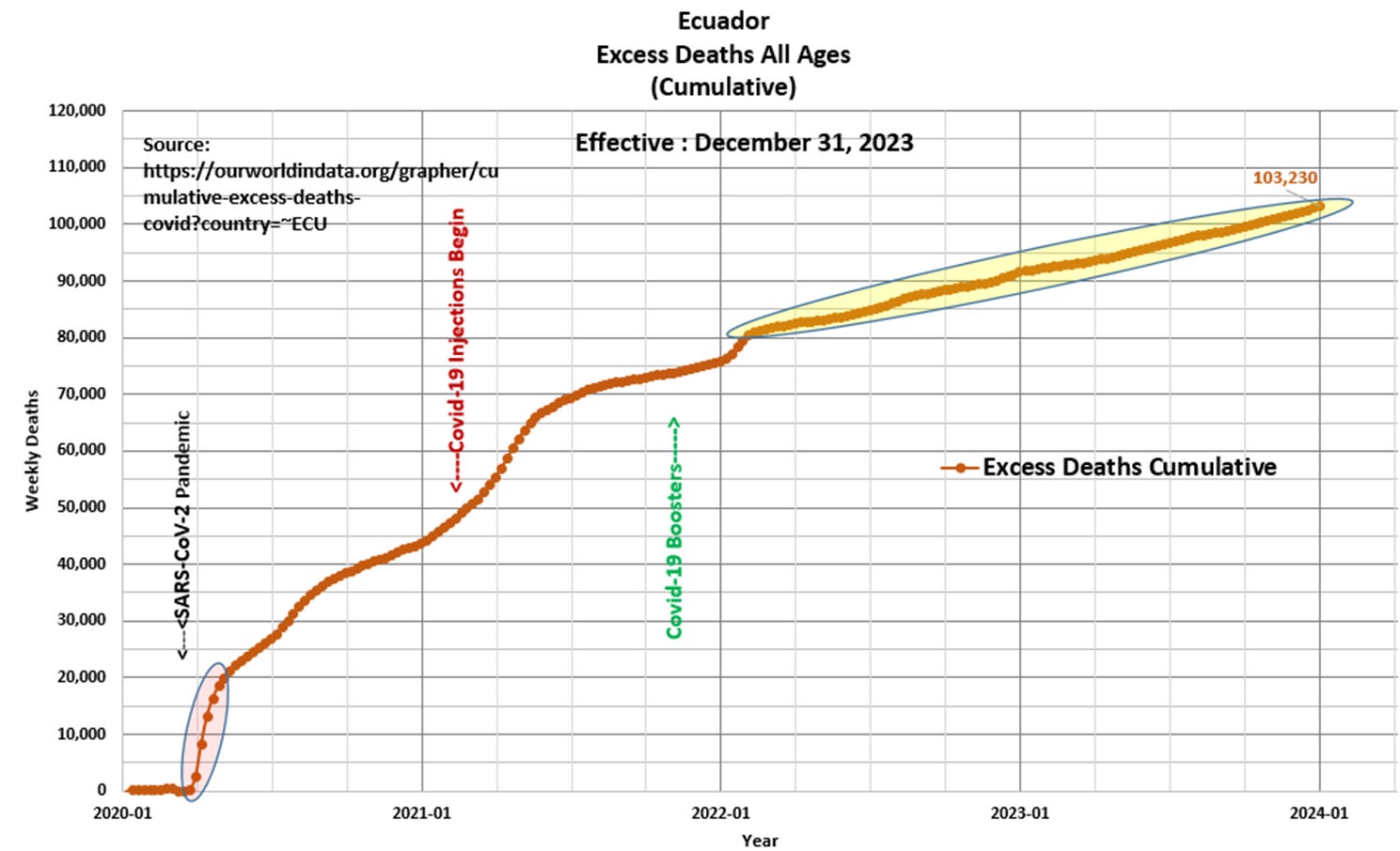
The author of the CotD has combined analyses of Covid-19 and Excess Deaths (all causes) as these are related.
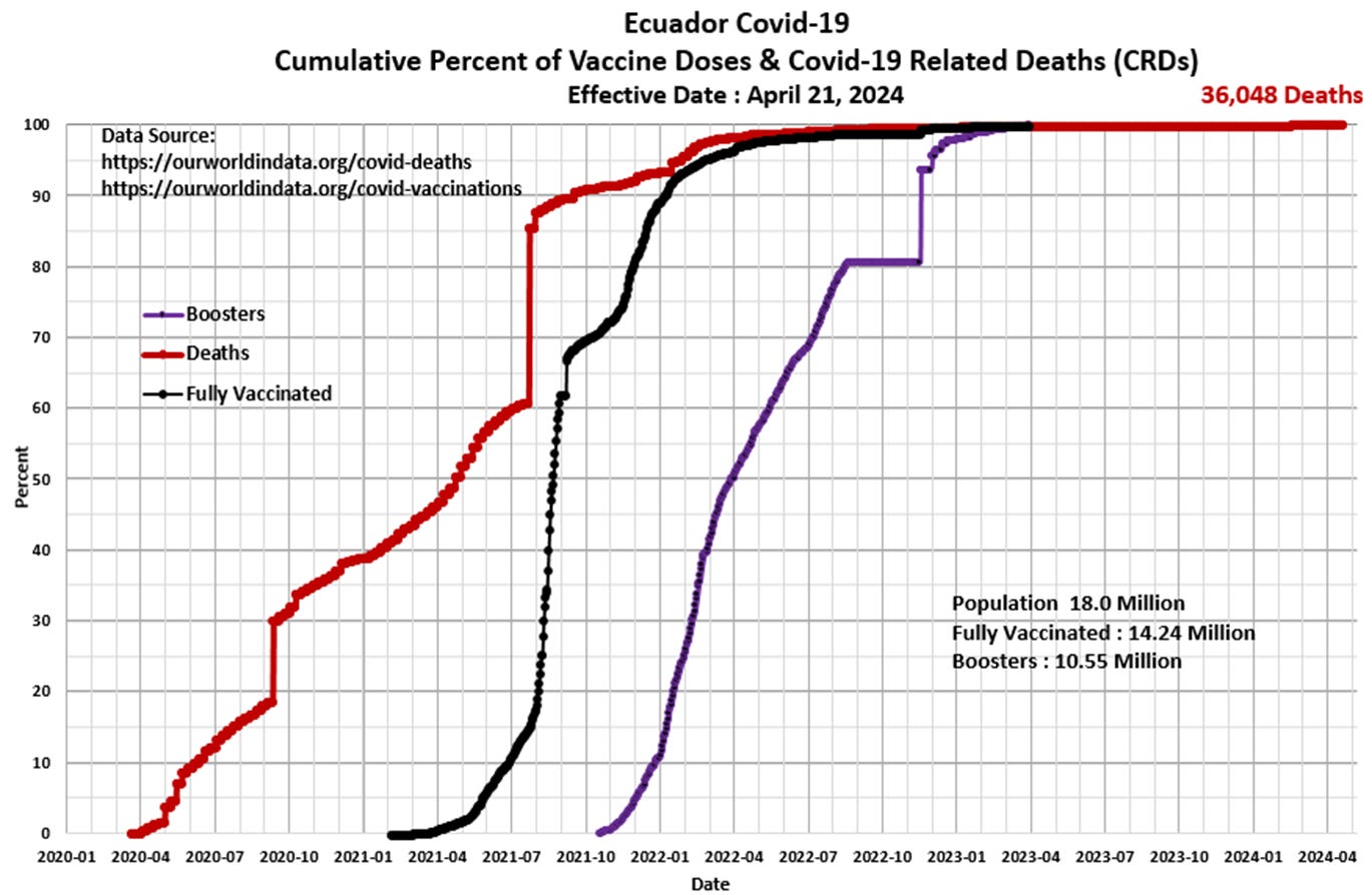
Panel 1 The first graph is a construct by the author as a standard CotD presentation which illustrates Covid-19 related deaths (CRDs) and vaccinations. The vaccination program began in February 2021 with little effect on the increasing death rate. The vaccination uptake increased dramatically in mid-2021 with a corresponding increase in deaths depicted by an unusual jump-shift anomaly (likely a database reporting issue). The CRD rate has subsided significantly as the vaccine program waned since early 2023.
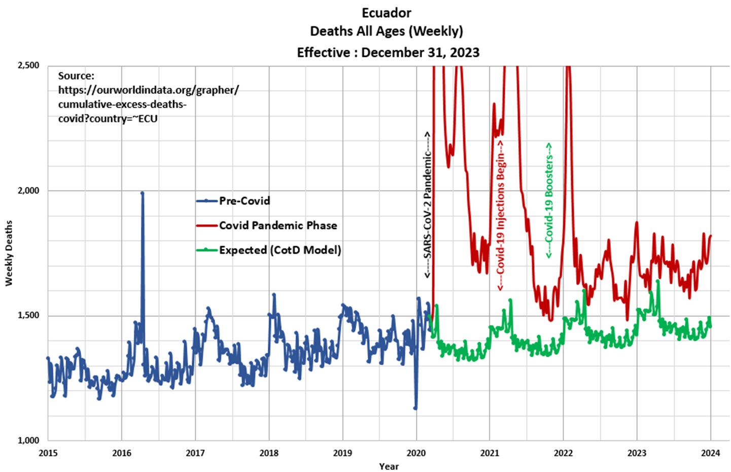
Panel 2 Observe the characteristic cyclical nature of deaths or all-cause mortality since 2015. The “Blue” line represents data prior to March 2020 and the “Red” line represents data since the SARS CoV-2 pandemic was initiated in March 2020. Due to the extreme levels of deaths in 2020 and 2021, the data was not visually included in this graphical presentation. The “Green” line represents the “Expected” deaths (CotD Model) based on historical averages. The author has utilized the five year period January 2015 to December 2019 in order to calculate an average normalized curve for Weekly Deaths. The Expected (CotD Model) deaths incorporates an average 7 percent growth factor (the highest to date) which appears to be a good match to the overall trend.
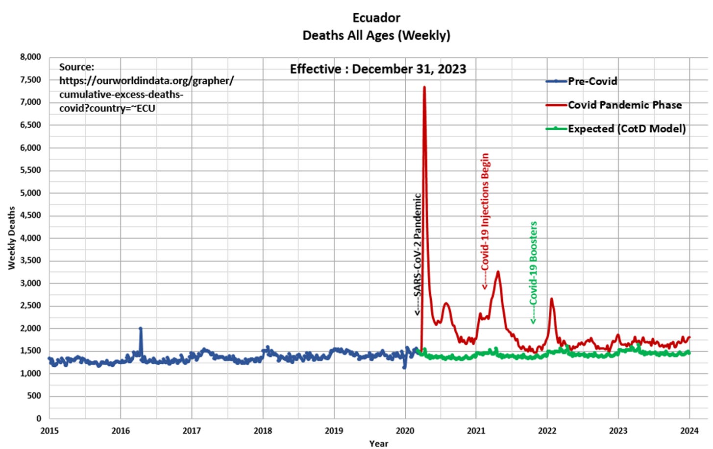
Panel 3 This presents the data in actual view to show the full effect of the Covid Pandemic Phase relative to Pre-Covid. Total deaths peaked at 7,252 (1,036 per day) for the week ending April 7, 2020, which represents an unprecedented massive spike of five times (5x) the average death rate. To date, the author of the CotD has not encountered this level of extreme deviation from the norm…this is a singularity of major proportion.
Panel 4 This presents the magnified portion (January 2020 to January 2024) of the graph in Panel 2. The “Orange” line represents “Excess Deaths” which is calculated by subtracting Expected Deaths from Official Deaths. Excess Deaths peaked at 5,806 during the week ending April 7, 2020, less than a month after the pandemic was officially announced.
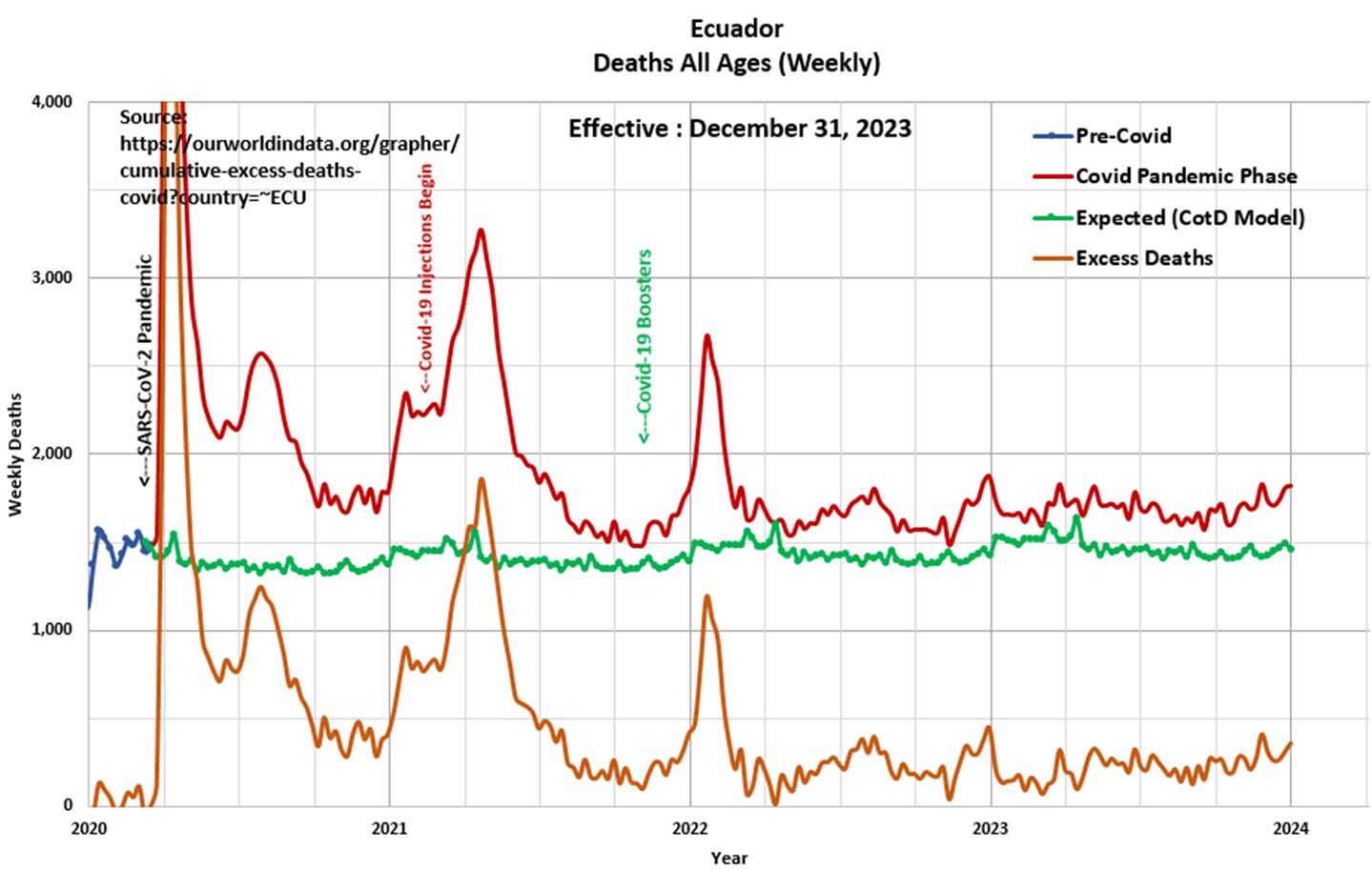
Panel 5 Based on the data and this author’s model 103,230 Excess Deaths have occurred since the start of the pandemic, of which 56,652 Excess Deaths (55 percent) have occurred since the start of Covid-19 injections in February 2021. This compares to 86,997 Excess Deaths since the start of the pandemic as per the ourworldindata.org website. In addition, Excess Deaths have increased an average of 14 percent per year since February 2022 (yellow high-lighted).
“An ancestor of mine maintained that if you eliminate the impossible, whatever remains, however improbable, must be the truth.” Spock (Star Trek VI The Undiscovered Country)
Panel 3 is very interesting.
It shows a serious surge in mortality in 2020.
In my country they really pumped the #s. Man with 3 bullet holes in his head tested positive with the PCR and was labeled a COVID victim for example.
There are many people I have noticed that have a PhD saying COVID was a hoax and never existed.
That SARS COV2 was never isolated thus doesn't exist. Dr Sam Bailey as one example.
I had one of these people read a recent artical and they were critical that you used COVID and Sars COV2 in your writing.
I do recall a very bad flu came through my small town like a grass fire.
We all got sick and recovered in early 2020.
I tried to tell everyone that our inate immune system would protect us from further infections but most lined up for the free mRNA therapy.
The gift that keeps on giving.
Cheers Eldric and thank you for today's education.
Hi Eldric, Your panel 3 raises a real and important question - what on earth happened in Ecuador in 2020?? Panel 1 shows there were two periods of a very steep increase in weekly deaths in that year, well before the vaccines. As you say, a five-fold spike in deaths may be unprecendented. (I am unclear over what period that is – but it is not for the full year of 2020 I think, but only for a few weeks?). What is needed is for people from that country to be made aware of the pattern of deaths and to talk about and discuss their lived experience of that time. A key question I would want to ask is “what were the ‘treatments’ used for people with covid in Ecuador in 2020? Were those ‘treatments’ killing people?”
Just another point, which I am sure you are well aware of, deaths ‘fom covid' is of course what should be used rather than 'covid-related deaths' (which overemphasises covid mortality), but in the early days of the pandemic this was not widely reported. Even deaths ‘from covid’ probably greatly overestimates covid mortality because of the very wide definitions used in coding the disease by the WHO.
Another question your graphs raise that is nothing to do with covid is "why were the number of deaths increasing so much annually even before covid?". I assume that's to do with population growth and ageing? Or does it show a country with a failing health service?